Responsive Grid
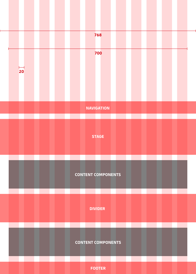
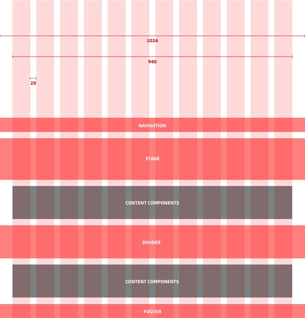
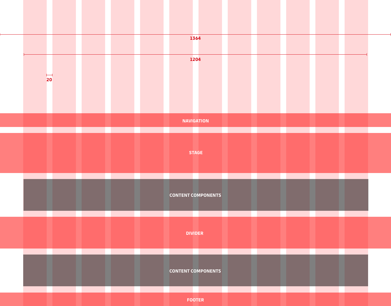
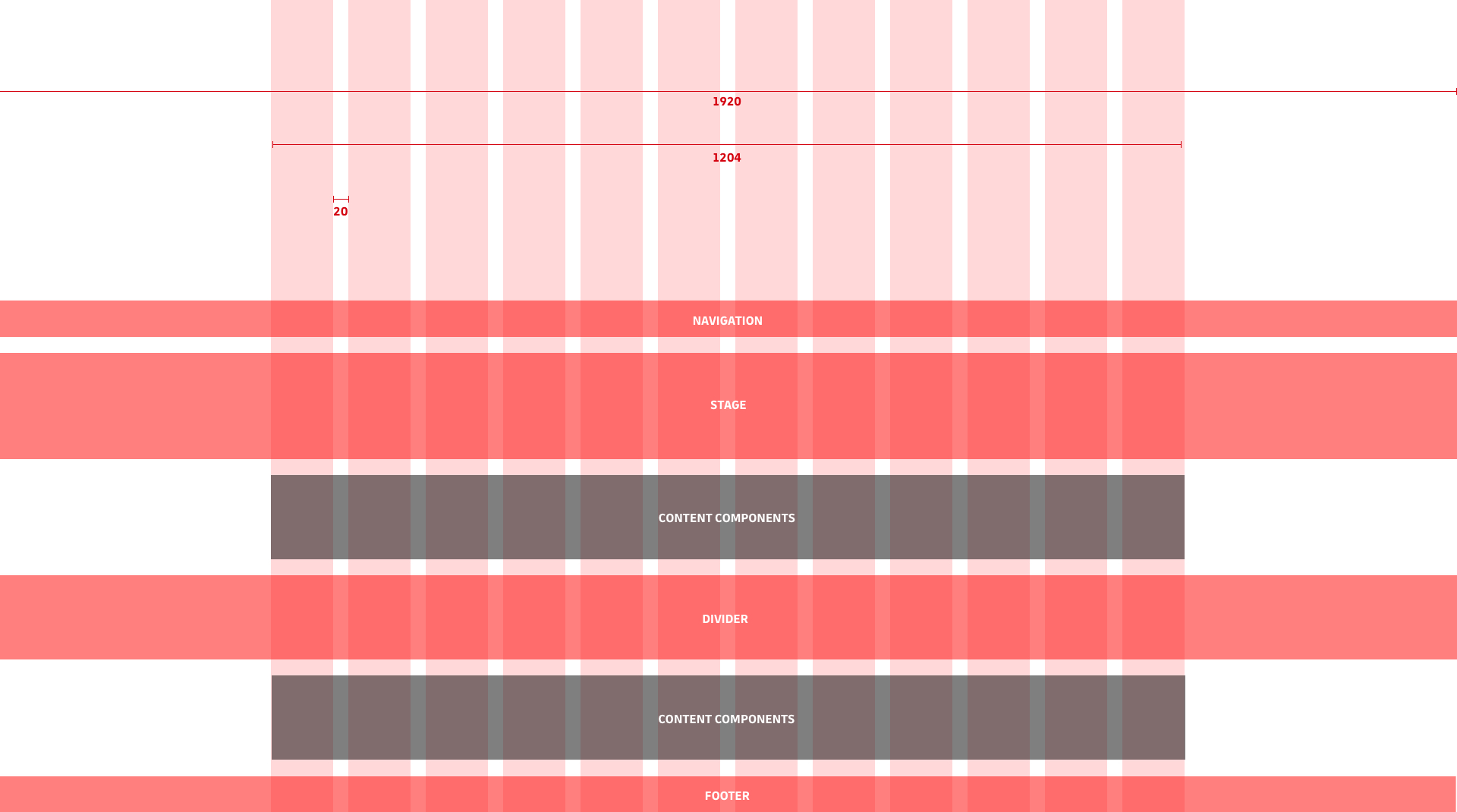
The following information outlines responsive layout configurations and values used within the DHL User Interface Library. Adherance to these values ensures consistency across a range of devices and screen sizes. Please refer to the images below for a visual representation of the responsive design principles provided by the DHL User Interface Library.
breakpoints
| Variable name | value 1 | value 2 |
|---|
SM (starting from 20rem)
- Total width: 280px
- Offset: 1.25rem
- Gutter: 1.25rem
- Off-Grid-Components: full width

MD (starting from 48rem)
- Total width: 700px
- Gutter: 1.25rem
- Off-Grid-Components: full width

LG (starting from 64rem)
- Total width: 940px
- Gutter: 1.25rem
- Off-Grid-Components: full width

XL (starting from 85.3125rem)
- Total width: 1204px
- Gutter: 1.25rem
- Off-Grid-Components: full width

2XL (starting from 120rem)
- Total width: 1204px
- Gutter: 1.25rem
- Off-Grid-Components: 1920px (max.)
