Installation
Get up and running with the DHL User Interface Library in your framework of choice.
Installation
- npm
- Yarn
- pnpm
- Bun
npm install @dhl-official/angular-library
yarn add @dhl-official/angular-library
pnpm add @dhl-official/angular-library
bun add @dhl-official/angular-library
Enable component library (recommended)
To use the DHL User Interface Library in your Angular application, simply import the defineCustomElements in your main.ts.
import { defineCustomElements } from '@dhl-official/stencil-library/loader';
defineCustomElements(window);
Then, simply import the ComponentLibrary in your app.ts. This automatically registers all DHL web components so Angular recognizes them.
import { Component, signal } from '@angular/core';
import { ComponentLibrary } from '@dhl-official/angular-library';
import { RouterOutlet } from '@angular/router';

@Component({
  selector: 'app-root',
  imports: [RouterOutlet, ComponentLibrary],
  templateUrl: './app.html',
  styleUrl: './app.css',
})
export class App {}
Enable CUSTOM_ELEMENTS_SCHEMA (Optional)
Use CUSTOM_ELEMENTS_SCHEMA only if necessary. Importing
ComponentLibrary already registers all DUIL components,
ensuring Angular recognizes them without schema overrides.
If your project requires suppressing Angular's validation for unknown custom elements (for example, during migration or prototyping), you can enable CUSTOM_ELEMENTS_SCHEMA as follows:
import { Component, signal, CUSTOM_ELEMENTS_SCHEMA } from '@angular/core';
import { RouterOutlet } from '@angular/router';

@Component({
  selector: 'app-root',
  imports: [RouterOutlet],
  templateUrl: './app.html',
  styleUrl: './app.css',
  schemas: [CUSTOM_ELEMENTS_SCHEMA],
})
export class App { }
Install styles
To install the component styles, navigate to angular.json and add the following to the styles array:
"styles": [
  "node_modules/@dhl-official/tokens/dist/css/index.css"
]
You should now be able to use DUIL components as following within your Angular application:
<duil310-dhl-button>Button</duil310-dhl-button>
Install icons
To install the icons, navigate to angular.json and add the following to the assets array:
{
  "glob": "**/*",
  "input": "node_modules/@dhl-official/icons/dist",
  "output": "assets/duil/icons"
}
You should now be able to use DUIL components as following within your Angular application:
<duil310-dhl-button icon="assets/duil/icons/android.svg">Button with icon</duil310-dhl-button>
The full list of icons is available in the Icon section of the library.
Troubleshooting
NG0203: inject() must be called from an injection context such
as a constructor, a factory function, a field initializer, or a function
used with runInInjectionContext.
If you encounter this error in the console.log, it indicates that you are using an outdated version of Angular, specifically a version lower than 16. To resolve this issue, you have two options. The recommended approach is to update your Angular version to 16 or higher. Alternatively, if upgrading is not feasible, you can modify your tsconfig.json file by adding the necessary configuration lines:
{
"compilerOptions": {
  "paths": {
    "@angular/*": ["node_modules/@angular/*"],
    "@dhl-official/*": ["node_modules/@dhl-official/*"]
  },
  "skipLibCheck": true,
}
}
Want to avoid invalid prop values?
Use the type-safe constants for consistent and reliable prop values. Read type-safe constants documentation
Do you have any questions?
Installation
The @dhl-official/react-library npm package is designed to provide the DHL User Interface Library components ready to be used in a React application with the added benefit of lazy loading. This package offers a more optimized approach to loading components, resulting in improved performance and reduced initial bundle size.
With the lazy loading feature, the components are not loaded upfront when the application starts. Instead, they are loaded on-demand as they are needed. This allows for a more efficient use of network resources and faster initial loading times.
In alternative, you may consider using @dhl-official/react-library-single-bundle, which does not provide lazy loading but delivers a single bundle JavaScript file.
- npm
- Yarn
- pnpm
- Bun
npm install @dhl-official/react-library
yarn add @dhl-official/react-library
pnpm add @dhl-official/react-library
bun add @dhl-official/react-library
Add styles and register custom elements
From library version 2.33.1 onwards, it is required to
remove defineCustomElements and replace it with
initDUIL.
Update your application entry-point to import the DUIL styles and register custom elements:
import React from "react";
import ReactDOM from "react-dom/client";
import App from "./App";
import "@dhl-official/tokens/index.css";
import { initDUIL } from "@dhl-official/react-library";

initDUIL();

ReactDOM.createRoot(document.getElementById("root")).render(
  <React.StrictMode>
    <App />
  </React.StrictMode>
);
You should now be able to use DUIL components as following within your React application:
<DhlButton>Button</DhlButton>
Single bundle installation
The @dhl-official/react-library-single-bundle npm package is designed to provide the DHL User Interface Library components ready to be used in a React application. It delivers a single bundle JavaScript file that contains all the necessary components.
It is important to note that the package does not provide a lazy loading feature. This means that all the components included in the bundle will be loaded upfront when the application starts. While this ensures that all the components are readily available for use, it may result in a larger initial bundle size and potentially slower loading times.
If lazy loading is a requirement for your application, you may consider using @dhl-official/react-library. However, it is worth noting that lazy loading may require additional configuration and setup.
Overall, the @dhl-official/react-library-single-bundle package provides a convenient way to access and utilize the DHL User Interface Library components in a React application, but it does not include a built-in lazy loading feature.
Install
- npm
- Yarn
- pnpm
- Bun
npm install @dhl-official/react-library-single-bundle
yarn add @dhl-official/react-library-single-bundle
pnpm add @dhl-official/react-library-single-bundle
bun add @dhl-official/react-library-single-bundle
Add styles
From library version 2.33.1 onwards, it is required to
remove defineCustomElements and replace it with
initDUIL.
Update your application entry-point to import the DUIL styles and register custom elements:
import React from "react";
import ReactDOM from "react-dom/client";
import App from "./App";
import "@dhl-official/tokens/index.css";
import { initDUIL } from "@dhl-official/react-library";

initDUIL();

ReactDOM.createRoot(document.getElementById("root")).render(
  <React.StrictMode>
    <App />
  </React.StrictMode>
);
Use custom components
You should now be able to use DUIL components as following within your React application:
import { DhlButton } from "@dhl-official/react-library-single-bundle";
...
<DhlButton>Button</DhlButton>
react hook form
The DHL User Interface Library does not employ react-hook-form for its form elements. This documentation page does not encourage the adoption of react-hook-form within the library. Instead, it showcases a simple, and possibly limited, use case of combining the library's own form element components with react-hook-form.
For more information on how to use react-hook-form and its capabilities, refer to the official documentation.
Example
This component, ReactHookFormTestPage, is a simple form page that uses the react-hook-form library for form handling. It includes a single input field for an email address and a submit button.
Import statements
The component is a functional component that uses the useForm hook from react-hook-form, as well as custom components and types from @dhl-official/react-library and @dhl-official/stencil-library.
Component structure
The component imports several hooks and components from react-hook-form to manage form state. The form includes validation and error handling.
Form handling
The useForm hook is initialized with a configuration object that sets the mode to "all" (meaning all fields are validated on every change) and sets the default values for the form fields.
The handleSubmit function from useForm is used to handle form submission. It takes two arguments: a callback function to be called on successful form submission (onValid), and a callback function to be called when form validation fails (onInvalid).
Form fields
The form includes a single field, "email", which is managed by the Controller component from react-hook-form. The Controller is configured with validation rules (the field is required and must include an "@" symbol), and a render function that returns a DhlInputField component.
The DhlInputField component is a custom input field component from @dhl-official/react-library. It is configured with a ref, event handlers for change and blur events (onDhlChange and onDhlBlur), a value, a variant, and validation settings.
Error handling
If form validation fails, the onInvalid function is called. This function retrieves the validation message from the DhlInputField component and sets it as the state of emailInputErrorMessage.
Submit button
The form includes a submit button, which is a DhlButton component from @dhl-official/react-library.
import {
useForm,
SubmitHandler,
SubmitErrorHandler,
Controller,
} from "react-hook-form";

import { DhlButton, DhlInputField } from "@dhl-official/react-library";
import { Variants } from "@dhl-official/stencil-library";
import { useRef, useState } from "react";

type InputDemo = {
email: string;
};

const ReactHookFormTestPage = () => {
const {
  handleSubmit,
  control,
  formState: { errors },
} = useForm<InputDemo>({
  mode: "all",
  defaultValues: {
    email: "",
  },
});

const emailInputRef = useRef(null);
const [emailInputErrorMessage, setEmailInputErrorMessage] = useState("");

const onValid: SubmitHandler<InputDemo> = async (e) => {
  console.log(e);
  setEmailInputErrorMessage("");
};

const onInvalid: SubmitErrorHandler<InputDemo> = async (e) => {
  console.log(e);
  const error = await (
    emailInputRef?.current as unknown as HTMLDuil310DhlInputFieldElement
  ).getValidationMessage();

  setEmailInputErrorMessage(errors.email?.message || error);
};

return (
  <form onSubmit={handleSubmit(onValid, onInvalid)} noValidate>
    <Controller
      name="email"
      control={control}
      rules={{
        required: true,
        pattern: /@/i,
      }}
      render={({ field }) => (
        <DhlInputField
          ref={emailInputRef}
          onDhlChange={field.onChange}
          onDhlBlur={field.onBlur}
          value={field.value}
          variant={{
            label: "email",
            placeholder: "Email Placeholder",
          }}
          validation={{
            type: errors.email ? Variants.invalid : Variants.valid,
            message: errors.email ? emailInputErrorMessage : "",
          }}
          type="email"
          required
        ></DhlInputField>
      )}
    ></Controller>
    <hr />
    <DhlButton color="red" type="submit">
      SUBMIT
    </DhlButton>
  </form>
);
};

export default ReactHookFormTestPage;
Want to avoid invalid prop values?
Use the type-safe constants for consistent and reliable prop values. Read type-safe constants documentation
Do you have any questions?
Installation
The @dhl-official/vue-library npm package is designed to provide the DHL User Interface Library components ready to be used in a Vue application with the added benefit of lazy loading. This package offers a more optimized approach to loading components, resulting in improved performance and reduced initial bundle size.
In alternative, you may consider using @dhl-official/vue-library-single-bundle, which does not provide lazy loading but delivers a single bundle JavaScript file.
- npm
- Yarn
- pnpm
- Bun
npm install @dhl-official/vue-library
yarn add @dhl-official/vue-library
pnpm add @dhl-official/vue-library
bun add @dhl-official/vue-library
Add styles and register custom elements
Update your application entry point to import the DUIL styles and register the underlying custom elements. Wait for registration to finish before mounting the Vue application so that component properties are forwarded correctly:
import { createApp } from 'vue';
import App from './App.vue';
import '@dhl-official/tokens/index.css';
import { defineCustomElements } from '@dhl-official/stencil-library/loader';

await defineCustomElements();

createApp(App).mount('#app');
Use DUIL components
Import each Vue component that you use. Components imported with PascalCase can also be written in kebab-case in the template:
<script setup>
import { DhlAlert, DhlButton } from "@dhl-official/vue-library";
</script>

<template>
<DhlButton>Button</DhlButton>
<DhlAlert
  body-text="Lorem ipsum dolor sit amet, consectetur adipiscing elit."
></DhlAlert>
</template>
The public duil310-dhl-* tags are Vue component wrappers, so they should not be added to Vue's compilerOptions.isCustomElement configuration. The wrappers render the namespaced web components internally.
Known issues
When using a web component directly instead of its Vue wrapper, some values must be passed as DOM properties with Vue's .prop modifier. See Vue's web components documentation for more information.
Single bundle installation
The @dhl-official/vue-library-single-bundle npm package is designed to provide the DHL User Interface Library components ready to be used in a Vue application. It delivers a single bundle JavaScript file that contains all the necessary components.
It is important to note that the package does not provide a lazy loading feature. This means that all the components included in the bundle will be loaded upfront when the application starts. While this ensures that all the components are readily available for use, it may result in a larger initial bundle size and potentially slower loading times.
If lazy loading is a requirement for your application, you may consider using @dhl-official/vue-library.
Overall, the @dhl-official/vue-library-single-bundle package provides a convenient way to access and utilize the DHL User Interface Library components in a Vue application, but it does not include a built-in lazy loading feature.
Install
- npm
- Yarn
- pnpm
- Bun
npm install @dhl-official/vue-library-single-bundle
yarn add @dhl-official/vue-library-single-bundle
pnpm add @dhl-official/vue-library-single-bundle
bun add @dhl-official/vue-library-single-bundle
Enable custom elements
In order to use the DHL User Interface Library's components in a Vue application you need to enable the usage of web-components. See the Vue and web-components guide for more information.
For example, to enable custom elements in an application that uses Vite, you can update your vite.config.ts as follows:
export default defineConfig({
plugins: [
  vue({
    template: {
      compilerOptions: {
        // treat all tags that starts with "dhl" as web-components custom elements
        isCustomElement: (tag) => tag.toLowerCase().includes('-dhl-'),
      },
    },
  }),
]
})
Add styles
Update your application entry-point to import the DUIL styles like this:
import { createApp } from 'vue';
import App from './App.vue';
import "@dhl-official/tokens/index.css";
createApp(App).mount("#app");
Use custom elements
When using the @dhl-official/vue-library-single-bundle
package it is not necessary to register the custom elements. This is
because the package automatically registers the custom elements for
you. Therefore, you can simply import the required components from the
package and use them in your code without the need to manually
register the custom elements.
There is a bug in the stencil code that affects the usage of @dhl-official/vue-library-single-bundle. As a result, it is necessary to manually import and execute the DHL User Interface Library global setup script.
Solution
Import the initDUIL function from @dhl-official/stencil-library and execute it.
Use the following code snippet to import and execute the initDUIL function:
// workaround to bug: https://github.com/ionic-team/stencil/issues/5680
import { initDUIL } from "@dhl-official/stencil-library";
initDUIL();
The entry-point of your application should finally look like this:
import { createApp } from 'vue';
import App from './App.vue';
import "@dhl-official/tokens/index.css";
import { initDUIL } from "@dhl-official/stencil-library";
initDUIL();
createApp(App).mount("#app");
You should now be able to use DUIL components as following within your Vue application:
import { DhlButton } from "@dhl-official/vue-library-single-bundle";
...
<DhlButton>Button</DhlButton>
Known issues
In some instances the .prop attribute is needed for certain properties. See the attribute documentation for details.
Want to avoid invalid prop values?
Use the type-safe constants for consistent and reliable prop values. Read type-safe constants documentation
Do you have any questions?
About & installation
The @dhl-official/icons package provides the DUIL SVG icons for use in any project. It is already included as a dependency of the framework packages, so install it separately only when you need to import icons directly.
Install
- npm
- Yarn
- pnpm
- Bun
npm install @dhl-official/icons
yarn add @dhl-official/icons
pnpm add @dhl-official/icons
bun add @dhl-official/icons
Usage
import { Airport } from "@dhl-official/icons";
You can also import an individual SVG file:
import Airport from "@dhl-official/icons/airport.svg";
See
Angular applications must also expose the SVG files through the assets
configuration. Please follow the
Do you have any questions?
About & installation
The @dhl-official/tokens package is a framework agnostic package that can be used in any project.
Using a framework-specific package? The tokens package is
inherently bundled as a dependency - no separate install needed.
Install
- npm
- Yarn
- pnpm
- Bun
npm install @dhl-official/tokens
yarn add @dhl-official/tokens
pnpm add @dhl-official/tokens
bun add @dhl-official/tokens
CSS
You can import all of the CSS generated rules by importing the index.css file.
import "@dhl-official/tokens/index.css";
By including this file, basename.css, animation.css and font-face.css are included into your application too. Additionally, CSS box-sizing rule is set to border-box and the html and body tags get the CSS font-family rules set to the value of the css variable --duil310-dui-font-family.
@import "base.css";
@import "animations.css";
@import "font-face.css";

*,
*::before,
*::after {
box-sizing: border-box;
}

html,
body {
font-family: var(--duil310-dui-font-family);
}
CSS variables
If you only want to import the CSS variables, you can either import them all or import them individually.
// import ALL the CSS variables
import "@dhl-official/tokens/base.css";
Animation
See the Guidelines & foundations | Animation duration for variables names and values.
// import only the animations @keyframes definitions
import "@dhl-official/tokens/animations.css";
// import only the CSS variables for the animation-duration definitions
import "@dhl-official/tokens/duration.css"
Typography
See the Guidelines & foundations | Typography for variables names and values.
// import only the @font-face rules
import "@dhl-official/tokens/font-face.css";
// import only the CSS variables for the typography definitions
import "@dhl-official/tokens/typography.css"
// import only the CSS variables for the font-family definitions
import "@dhl-official/tokens/font-family.css"
// import only the CSS variables for the font-size definitions
import "@dhl-official/tokens/font-size.css"
// import only the CSS variables for the font-weight definitions
import "@dhl-official/tokens/font-weight.css"
// import only the CSS variables for the letter-spacing definitions
import "@dhl-official/tokens/letter-spacing.css"
// import only the CSS variables for the letter-height definitions
import "@dhl-official/tokens/line-height.css"
Radius
See the Guidelines & foundations | Radius for variables names and values.
// import only the CSS variables for the radius definitions
import "@dhl-official/tokens/radius.css"
Border width
See the Guidelines & foundations | Border width for variables names and values.
// import only the CSS variables for the border-width definitions
import "@dhl-official/tokens/border-width.css"
Shadow
See the Guidelines & foundations | Shadow for variables names and values.
// import only the CSS variables for the shadow definitions
import "@dhl-official/tokens/shadow.css"
Spacings
See the Guidelines & foundations | Spacings for variables names and values.
// import only the CSS variables for the space definitions
import "@dhl-official/tokens/space.css"
Font files
The Delivery fonts can be downloaded from the DHL Brand Hub.
import "@dhl-official/tokens/fonts/Delivery/Delivery_W_Bd.woff2"
import "@dhl-official/tokens/fonts/Delivery/Delivery_W_BdIt.woff2"
import "@dhl-official/tokens/fonts/Delivery/Delivery_W_CdBlk.woff2"
import "@dhl-official/tokens/fonts/Delivery/Delivery_W_CdLt.woff2"
import "@dhl-official/tokens/fonts/Delivery/Delivery_W_It.woff2"
import "@dhl-official/tokens/fonts/Delivery/Delivery_W_Lt.woff2"
import "@dhl-official/tokens/fonts/Delivery/Delivery_W_LtIt.woff2"
import "@dhl-official/tokens/fonts/Delivery/Delivery_W_Rg.woff2"
import "@dhl-official/tokens/fonts/DeliveryArabic/Delivery_Arabic.woff2"
import "@dhl-official/tokens/fonts/DeliveryVietnamese/Delivery_Viet.woff2"
import "@dhl-official/tokens/fonts/Assistant/Assistant_Light.woff2"
import "@dhl-official/tokens/fonts/Assistant/Assistant_Regular.woff2"
import "@dhl-official/tokens/fonts/Assistant/Assistant_Medium.woff2"
import "@dhl-official/tokens/fonts/Assistant/Assistant_Bold.woff2"
import "@dhl-official/tokens/fonts/Assistant/Assistant_ExtraBold.woff2"
Do you have any questions?
Installation
- npm
- Yarn
- pnpm
- Bun
npm install @dhl-official/stencil-library
yarn add @dhl-official/stencil-library
pnpm add @dhl-official/stencil-library
bun add @dhl-official/stencil-library
Copy files
This is an example folder structure. You can adjust the folder structure according to your project — just make sure to adjust the paths in the code snippets accordingly.
Copy the following files and folders to your project folder:
| Name | Source package | Target folder |
|---|---|---|
| CSS | node_modules/@dhl-official/tokens/dist/*.css | css/duil/ |
| Fonts | node_modules/@dhl-official/tokens/dist/fonts/*.* | css/duil/semantics/@dhl-official/tokens/fonts/ |
| Icons | node_modules/@dhl-official/icons/dist/*.svg | assets/duil/icons/ |
| ES Modules | node_modules/@dhl-official/stencil-library/dist/esm/*.* | js/duil/esm/ |
Use the script below to copy the necessary files. Run it in your project root folder using either a Bash or PowerShell terminal.
Bash script
declare -A sourcePaths=(["CSS"]="./node_modules/@dhl-official/tokens/dist/css/*" ["Fonts"]="./node_modules/@dhl-official/tokens/dist/fonts/*.*" ["Icons"]="./node_modules/@dhl-official/icons/dist/*.svg" ["ESModules"]="./node_modules/@dhl-official/stencil-library/dist/esm/*.*"); declare -A targetPaths=(["CSS"]="./css/duil/" ["Fonts"]="./css/duil/semantics/@dhl-official/tokens/fonts/" ["Icons"]="./assets/duil/icons/" ["ESModules"]="./js/duil/esm/"); copy_files() { local source=$1; local target=$2; mkdir -p "$target"; cp -r $source "$target"; }; for key in "${!sourcePaths[@]}"; do source=${sourcePaths[$key]}; target=${targetPaths[$key]}; echo "Copying $key files from $source to $target"; copy_files "$source" "$target"; done; echo "File copy operation completed."
PowerShell script
$sourcePaths = @{"CSS"=".\\node_modules\\@dhl-official\\tokens\\dist\\css\\*";"Fonts"=".\\node_modules\\@dhl-official\\tokens\\dist\\fonts\\*.*";"Icons"=".\\node_modules\\@dhl-official\\icons\\dist\\*.svg";"ESModules"=".\\node_modules\\@dhl-official\\stencil-library\\dist\\esm\\*.*"}; $targetPaths = @{"CSS"=".\\css\\duil\\";"Fonts"=".\\css\\duil\\semantics\\@dhl-official\\tokens\\fonts\\";"Icons"=".\\assets\\duil\\icons\\";"ESModules"=".\\js\\duil\\esm\\"}; function Copy-Files { param ([string]$source, [string]$target) if (-not (Test-Path -Path $target)) { New-Item -ItemType Directory -Path $target -Force }; Copy-Item -Path $source -Destination $target -Recurse -Force }; foreach ($key in $sourcePaths.Keys) { $source = $sourcePaths[$key]; $target = $targetPaths[$key]; Write-Host "Copying $key files from $source to $target"; Copy-Files -source $source -target $target }; Write-Host "File copy operation completed."
After copying the files, your project folder should look like this:
project-root
│
├── css
│   └── duil
│       └── index.css
│       └── base.css
│       └── semantics.css
|       └── primitives
|       └── semantics
|           └── @dhl-official
|               └── tokens
|                   └── fonts
│
├── assets
│   └── duil
│       └── icons
│           └── *.svg
│
├── js
│   └── duil
│       └── esm
│           └── loader.js
│
└── index.html
Enable custom elements
To enable the DHL User Interface Library components in your application, you need to include the highlighted lines in your index.html file:
<html>
<head>
  <title> DHL User Interface Library</title>
  <meta charset="UTF-8">
  <meta name="viewport" content="width=device-width, initial-scale=1.0">
  <link rel="stylesheet" href="/css/duil/index.css">
  <script type="module">
    import { defineCustomElements } from '/js/duil/esm/loader.js';
    defineCustomElements();
    var navBar = document.querySelector('duil310-dhl-navbar');
    navBar.logo = {
      "href": "#",
      "title": "Company Name - Tagline",
      "external": false,
      "alt": "Company Logo"
    };
  </script>
  <style>
    body {
      margin:0
    }
  </style>
</head>
<body>
  <duil310-dhl-navbar></duil310-dhl-navbar>
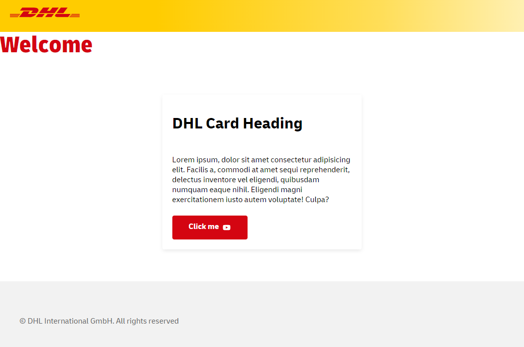
  <duil310-dhl-headline color="red">Welcome</duil310-dhl-headline>
  <div style="width: 400px; margin: 4rem auto;">
  <duil310-dhl-card>
    <h1 slot="header">DHL Card Heading</h1>
    <duil310-dhl-text>
    Lorem ipsum, dolor sit amet consectetur adipisicing elit. Facilis a, commodi at amet sequi reprehenderit, delectus inventore vel eligendi, quibusdam numquam eaque nihil. Eligendi magni exercitationem iusto autem voluptate! Culpa?
  </duil310-dhl-text>
  <duil310-dhl-button slot="footer" icon="/assets/duil/icons/youtube.svg">
    Click me
  </duil310-dhl-button>
  </duil310-dhl-card>
</div>
  <duil310-dhl-footer copyright="© DHL International GmbH. All rights reserved"></duil310-dhl-footer>
</body>
</html>
Expected output
Usage
You should now be able to use DUIL components as following within your application:
<duil310-dhl-button>Button</duil310-dhl-button>