For designers
The DUIL Design system equips teams with a comprehensive kit to create high-quality, accessible digital products. Serving as our shared language, it facilitates collaboration among designers, engineers, and product leaders.
DUIL library
DUIL library in Figma
DUIL library
Access the core DUIL design library to streamline your workflow. This resource includes a robust, ready-to-use components library, as well as detailed guidelines for typography, surfaces, and colors to ensure visual consistency.
Go to DUIL library
*Please note that before using the library, you must create a Figma account and get access. See the Getting Figma access section for more details.
Including

Semantic colors

Surfaces
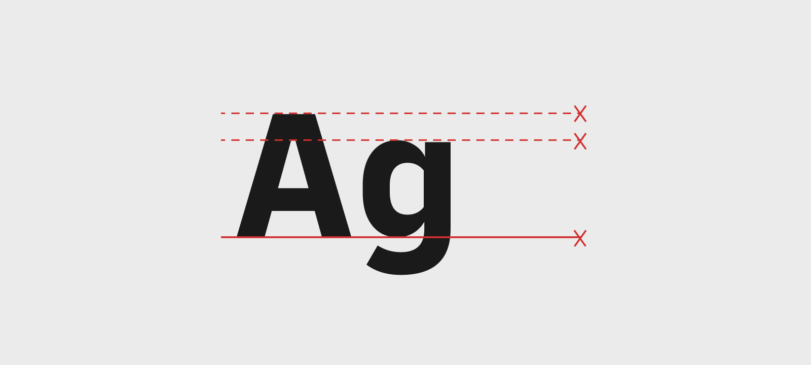
Typography
Other Figma libraries

Illustrations

Icons

Flags
Access DUIL official standard national flags collection.
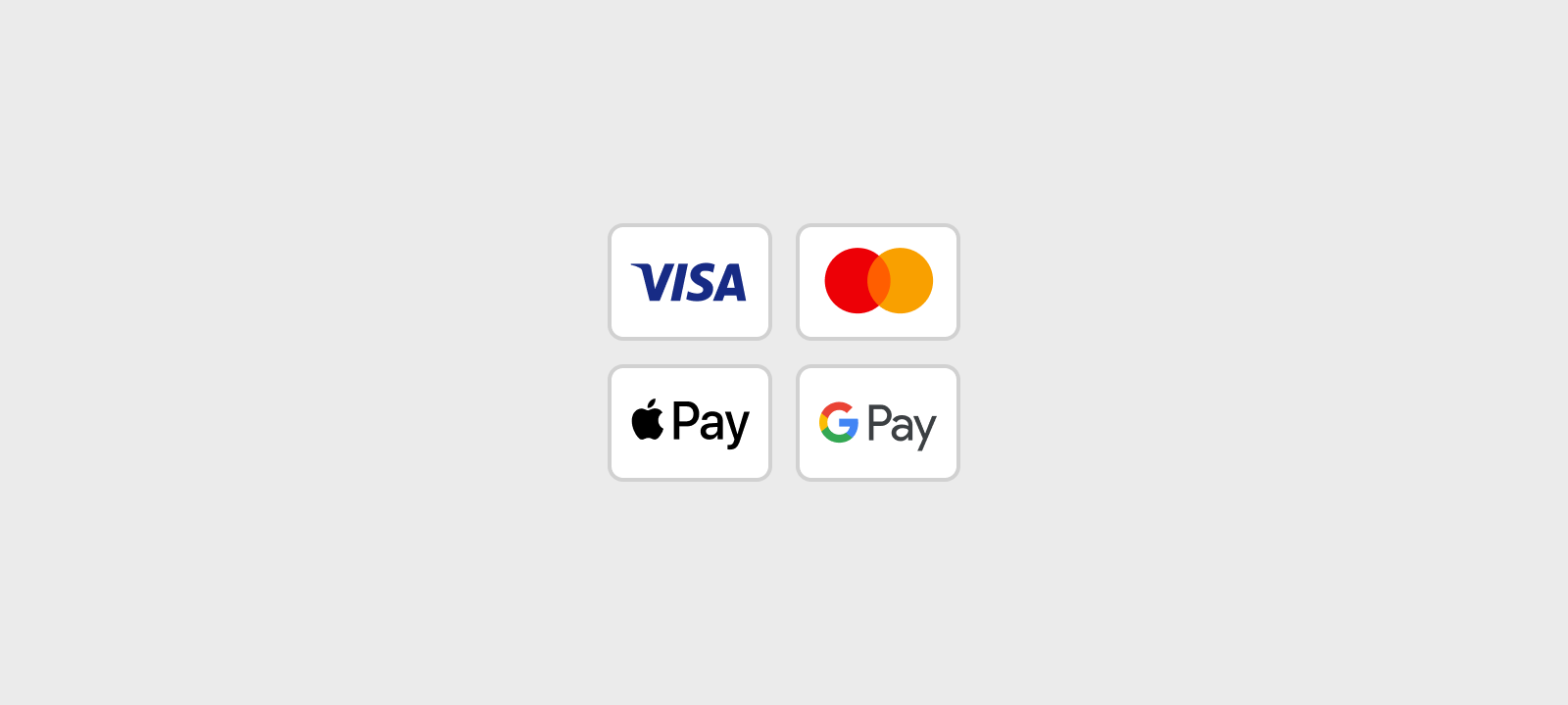
Payment methods
Please note that before using the library, you must create a Figma account and get access. See the "Getting Figma access" section for more details.
Additional resources
Brandhub
Media library
Download official brand media assets to use in your projects.
Illustration builder
Create custom illustrations using DHL official builder.
Accessibility playbook
Do you have any questions?
Request access
Access request process differs based on the type of user and the role of person who raises the request. You can find more information on types of requests below.
Request IT portal
For internal users and external @dhl.com account holders.
GSD form
Use this form to request access on employees' behalf.
Request IT for guests
Internal users
Usually line manager will send the approval letter and request the access on employee's behalf. Alternatively internal users can request access themselves directly through Request IT portal.
External users
@dhl.com account holders
The process is similar to internal users. Usually line manager will send the approval letter and request the access on user's behalf. Alternatively external users, who hold @dhl.com email addresses, can request access themselves directly through Request IT portal.
Externals without @dhl.com account (guests)
Currently line managers handle accesses for the externals without @dhl.com account. Request IT guest section for self-initiated requests is coming soon.
For managers
Please use GSD form to request license on behalf of the internal or external employees.
Do you have any questions?
Access & onboarding
Users with @dhl.com account
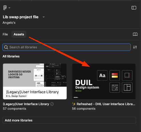
The DUIL library will automatically be available in your Figma Assets panel.
Users without @dhl.com account (guests)
You will need someone with access to share the direct file link with you so you can request viewing access. Please contact your line manager or Dennis Appelrath.
To use our pre-installed component library, simply open the Assets panel on the left side of your Figma design file. Our library will be listed there. Click on it to view and drag the desired components into your design.
Both our design files and development environments are built on documented semantic tokens rather than raw values. This enforces system consistency and guarantees that your designs will automatically adapt if our core brand colors ever change.
Usage guidelines
When should I build a new custom component versus modifying an existing DUIL component?
Before building a custom component from scratch, take a moment to evaluate your specific use case by thoroughly checking both the Figma library and the development environment (Storybook).
- Check for existing solutions: Does something functionally identical already exist under a different name? Can you achieve your layout using an existing component's built-in properties or a slot variant?
- When to build new: You should only build a new component if your use case is highly niche and unsupported by the current system.
- Rules for custom builds: If you do build a custom component, you must use existing DUIL design tokens.
- Requesting from the team: If you feel your use case isn't niche and the component would benefit others, you can request a new component directly from the system team.
Yes, but customization should happen within the boundaries of the system. You are encouraged to leverage the exposed component properties in the right sidebar — such as swapping icons, toggling layer visibility, modifying text, or changing state variants. Swapping semantic tokens to fit your needs is also perfectly fine, provided you stick to our official token set.
If you find yourself needing to detach a component completely to change its structure, check if a more flexible base component is available first. Detaching should be a last resort, as it permanently disconnects your design from future system updates and bug fixes.
What is the correct way to handle text truncation and long-string localization in components?
While DUIL provides default behaviours for text truncation and long-string localization, handling these scenarios is ultimately a product-level decision rather than a strict system rule. Your final approach should be determined by your designer or product team based on the specific context of your application. If you encounter any issues or need further guidance, please reach out to our support team via our Microsoft Teams community.
Theming & asset standards
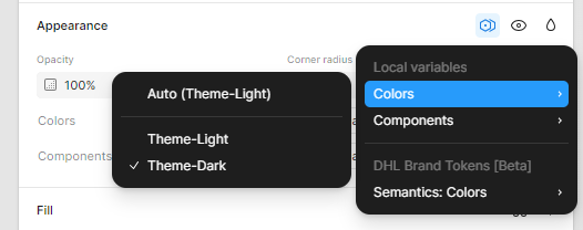
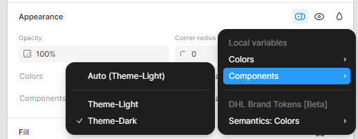
To change the appearance of your Figma component library between light and dark mode:
- Open the Component Library: Navigate to the Assets panel in your Figma design file and locate your component library.
- Adjust Color Settings: In the Properties panel, modify the color settings for each component to match your desired light and dark mode appearances.
How do I ensure my custom icons match DUIL system standards?
We have a current set of DUIL icons available, though our team is also in the process of developing a new set. To ensure your custom icons match our system standards, please closely inspect the existing icons and align your designs with the official brand guidelines.
Yes, the DUIL library is fully optimized for AI tools. We have written detailed descriptions for every component and prepared the web syntax, ensuring everything is accurately mapped for compatibility with Figma Make and Figma AI agents.
Governance & contributions
How do I request a new component or variant that isn't currently in DUIL?
To request a new component or variant, please join our Microsoft Teams community and submit your request publicly. This helps us track system needs transparently and allows other designers to weigh in if they have similar use cases. Alternatively, if you don't have easy access to the Teams community, you can:
- reach out directly to Dennis Appelrath;
- leave a comment in the DUIL Figma file.
We actively encourage contributions to help the design system grow! If you have built a component that would benefit the wider team, internal employees can present the working file directly to the Design Council. Alternatively, you can:
- propose your contribution by joining our Microsoft Teams community;
- leave a comment in the DUIL Figma file.
How do I propose a modification to an existing design token value?
Because changing a design token value ripples across the entire product ecosystem, these modifications require careful review. To propose a change, internal employees can submit their request and reasoning to the Design Council.
Alternatively, you can:
- suggest the modification in our Microsoft Teams community;
- leave a comment in the DUIL Figma file.
Yes! Here is how you can access or request them:
- Illustrations: You can find and create what you need using our Community Illustration library and the Illustration Builder Portal.
- Icons: You can browse the dedicated Figma Icons library to find all available assets. If you need a custom one created, you can submit a request directly in our Microsoft Teams community.
Troubleshooting
What should I do if I notice a discrepancy between the Figma component and the production code?
We greatly value this feedback! Catching inconsistencies is crucial for maintaining a healthy and reliable design system. If you spot a mismatch between the Figma design and the coded component in Storybook, please contact Dennis Appelrath directly or report the bug in our Microsoft Teams community.
When you reach out, providing links to both the Figma file and the Storybook instance will help us investigate and resolve the issue quickly.